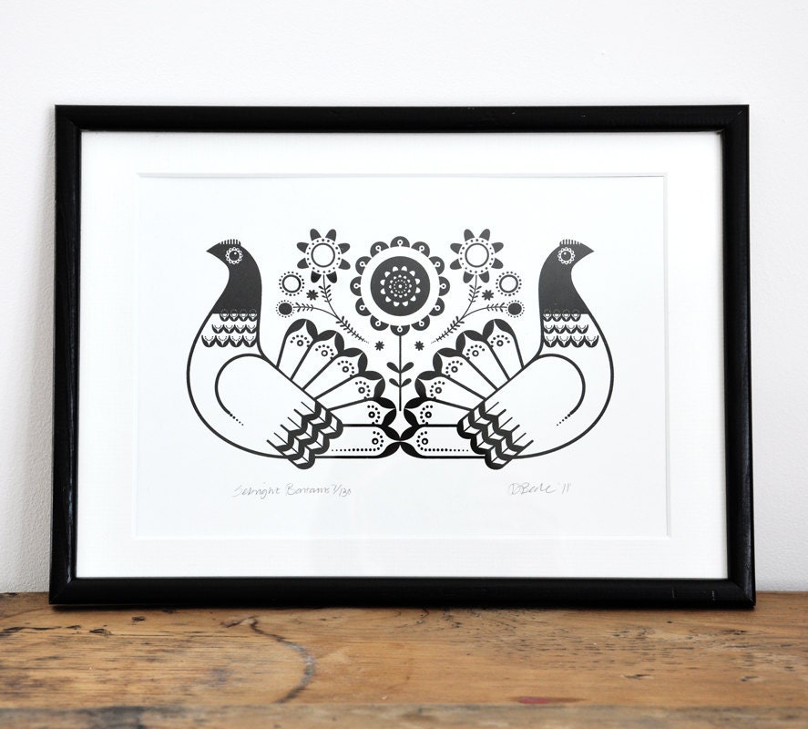


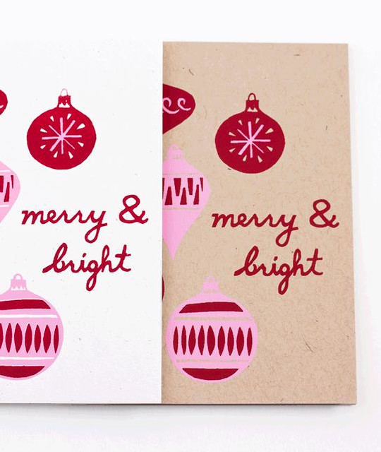
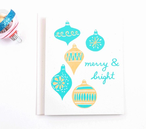
I haven't shared one of these "evolution of a design" posts in a while and I thought it would be fun to go behind the scenes on one of my brand new holiday cards, Merry & Bright. A lot of behind the scenes work goes into my designs, and while my techniques can vary (papercut designs, pencil sketches, inked finished drawings, or digital designs), my overall process is pretty consistent across the board.
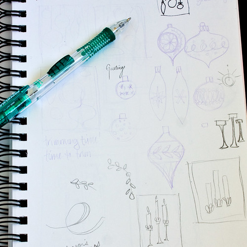
Everything always starts in my sketchbook. Sometimes I'll sketch out ideas multiple times before I'm ready to proceed with a design. Other times, only a couple quick sketches is all I need as a launching point. For this holiday card, I made a few super-quick sketches in purple pencil (definitely not my usual tool of choice) in the sketchbook and I was ready to go. I knew I wanted to translate these to papercuts and I'll usually work out little details on the actual paper.
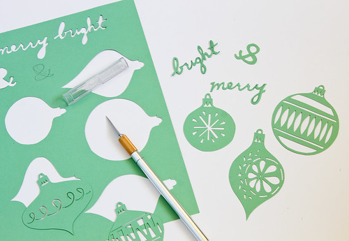
I sketched each ornament and the words "merry & bright" onto the paper and got to cutting with my xacto. The xacto Z series blades are my favorite to work with. Make sure to use a new blade every time you start a new papercut project!
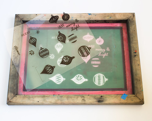
Next, I scanned each of the cut pieces into Photoshop where I cleaned up edges and made sure the text was legible. Then everything goes into Illustrator where I live trace each piece and arrange and scale it onto the size of the card. Sometimes this step takes quite a bit of time! It's like a puzzle, trying to find a good spot for each element so that it compliments the overall design. After I get an arrangement I like, I'll start separating out the color accents. Since I intended this card to be a two color screen print, I had to choose where the color would go, select those elements, and separate them. With a screen print, each color is applied in a separate layer, so this adds a bit of complexity to the design setup in the computer.
I'll separate everything out in illustrator, do a test print on paper to make sure I like the sizes and proportions, and print it out onto a transparency in full black and expose it onto a screen (that I stretched and coated with photo emulsion before-hand). After I wash out the screen, I'll decide on ink colors and get to screen printing the design.
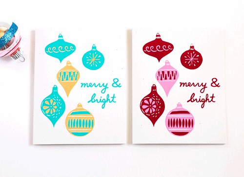
Ta-da! Here are the finished cards. I decided to go with red & pink and teal & gold colorways.
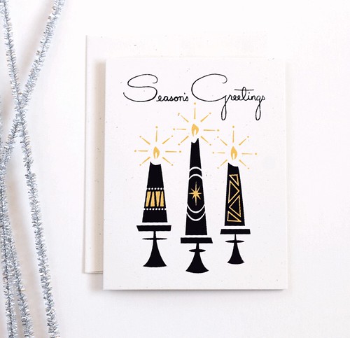
Both are available for purchase in my shop, along with my other brand new holiday card, Season's Greetings, featuring retro candlesticks.
I hope you enjoyed seeing this little behind-the-scenes glimpse at my process!


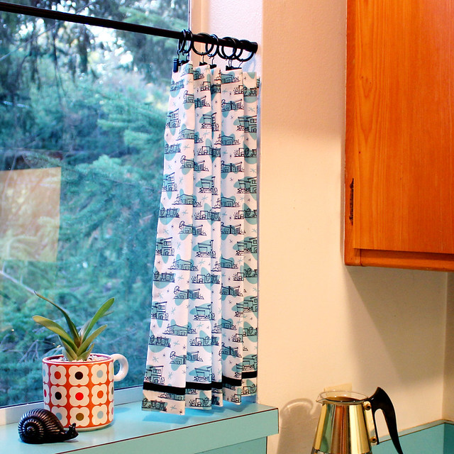
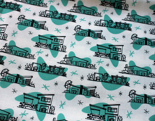
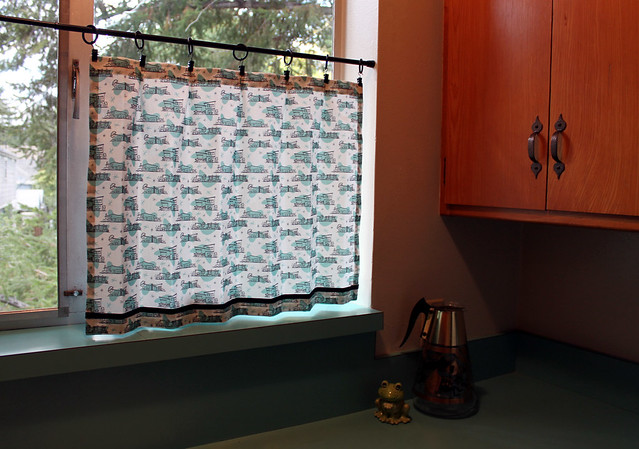
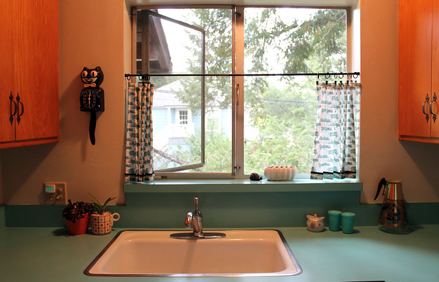
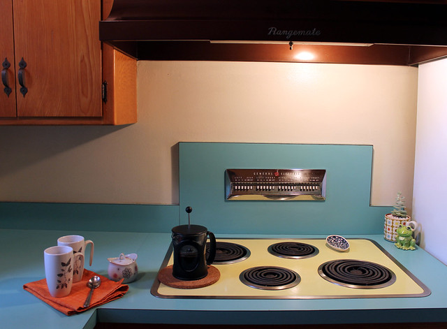
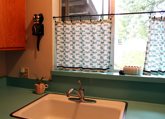 Here are few more photos of my 1950's kitchen. My great aunt gave me that KitKat clock for my 11th birthday. I think I was born loving retro...
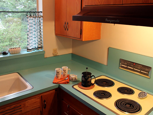

.JPG)


.JPG)